Top 10 Branding Fails
Creative Director, Hadrien shares which brands have caught his eye in the last week.
- 10. Weight Watchers -
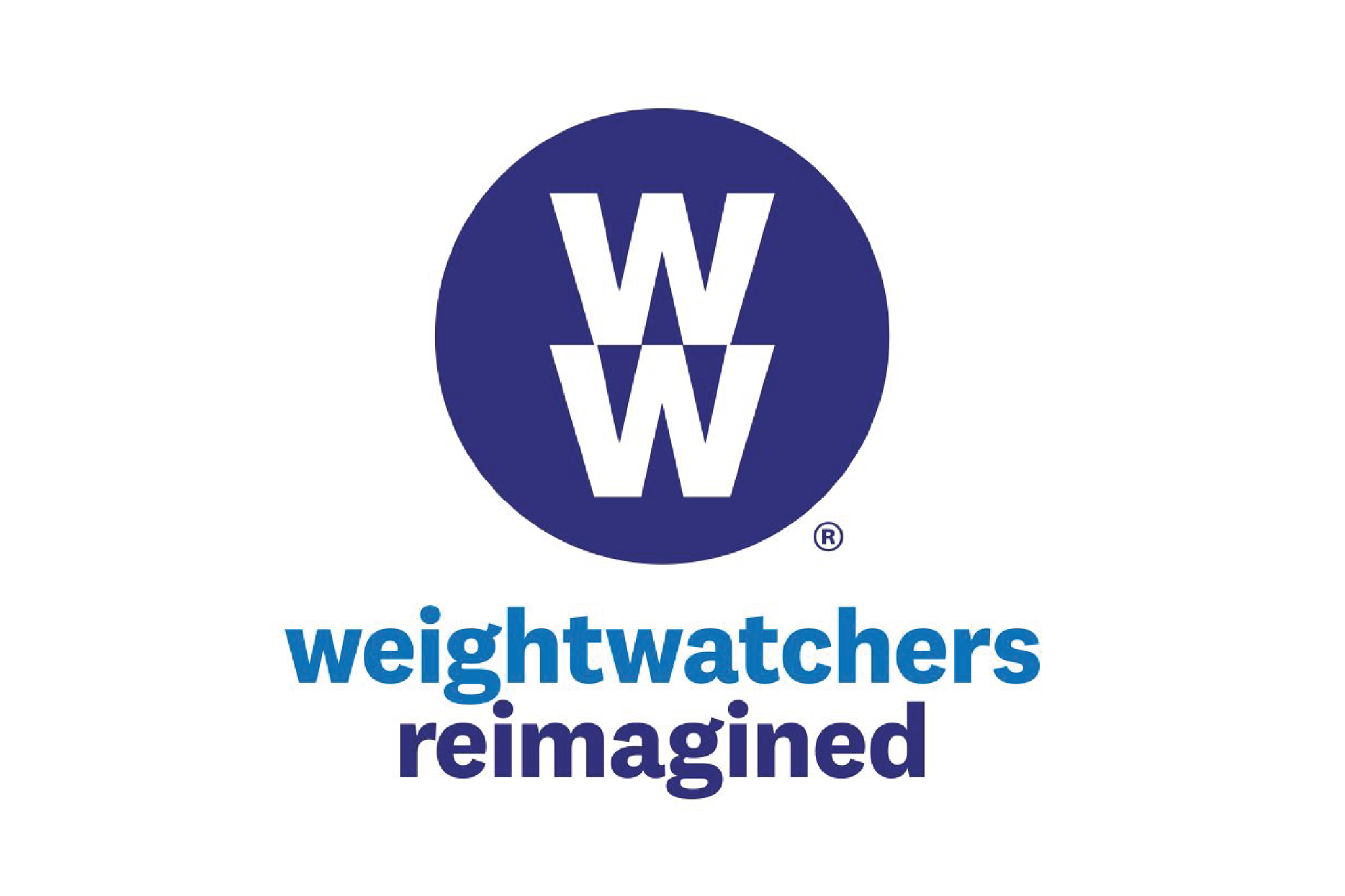
For a brand how prone to help during your journey of weight loss by being next to you all the way. It is freezing cold. The two W are angular with sharp edges. It looks like an appliance manufacturing company. The blue is the most uninspiring color when it comes to food, (maybe that was done in purpose?)
- 09. Argentina -
Argentina (the country) The letter "A" concept is interesting but is really flat. The execution doesn't even come close to express all the beauty and treasure of Argentina. Where is the warmth of the music and wilderness of the landscapes and the taste of the food?
- 08 Slack -
Sometimes you have so much expectation that the result makes you feel sad. It's exactly what I thought about Slack rebrand. The concept is there, but where is the innovation, where is the creativity? Why does Slack and Pentagram didn't push father away? #Sad
- 07 JCPenney -
JCPenney has rebrand three times in three years to come back to the original one. When is not right is not right. No comments.
https://www.underconsideration.com/brandnew/archives/old_logo_for_jcpenney.php
- 06 Peppersmith mint -
Here is a great example of a missed opportunity. The new branding is very well executed and appealing. But yet, It is failing a bit with character and story. Pardon my French.
- 05 NBC Universal -
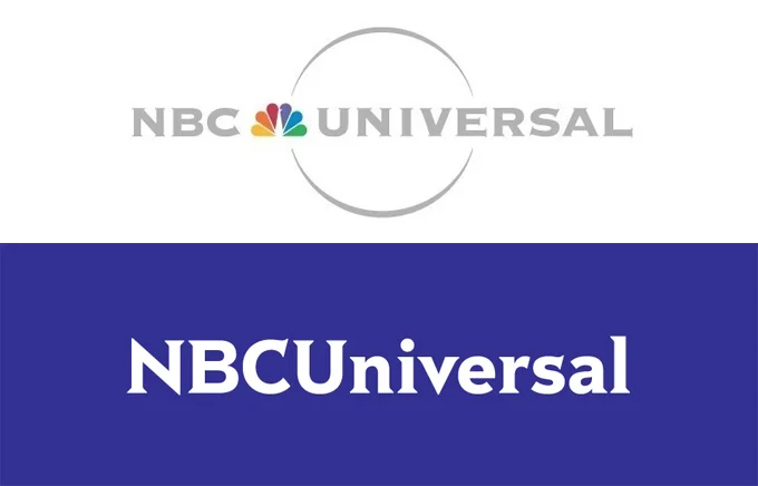
Where is he gone? What's happened? Am I becoming old men scare of change, or do you think like me that having lost the colorful peacock is a mistake? The dark blue is uninspiring. Where is the entertainment? This is so serious and boring.
- 04 John Lewis -
John Lewis, It's maybe a bit hard to call it a fail, but by wanting to align the brand together, it looks like they have forgotten the own story. It's a lot of time and money for a common result.
- 03 GAP -
GAP, let's not be too hard, first they have tried, and then they realize the mistake. You can not be truly creative if you stay safe. The mistakes have to be part of the creative process if we want to be remotely innovative. So kudos
- 02 Black & Decker -
Don't give me wrong, they were not the most impactful brand in the world, but this rebrand just downgrade them to the least inspiring tools brand. Now is nowhere to differentiate them to the cheap B&Q sub-brand. Ouch!
- 01 Facebook -
I know that many of you will not agree with me; with honesty, this choice is a bit controversial. Why one of the most powerful brands know today is refusing to have a voice, a character, or even some behavior. Billion of users give Facebook a large part of their day, but never Facebook brand give back any emotions or stories. It's like an abusive relationship.


